
On the Materiality of Painting
By Sam Powers
“Modernist painting oriented itself to flatness as it did to nothing else” writes art critic Clement Greenberg in “Modernist Painting.” Seeing flatness as the defining characteristic of painting, Greenberg argues painting should bring attention to its own flatness as a method of self criticism. Another influential art critic, Harold Rosenberg, values the emotional performance of action painting, a style of painting which emphasizes gesture, as the centerpiece to modernist paintings. However, these two views of modernist painting are not diametrically opposed. When viewing Jackson Pollock’s No. 2 (1950), Mark Rothko’s Untitled (1947), and Josef Albers’s Against Deep Blue (1955), it is clear Rosenberg’s and Greenberg’s arguments are not mutually exclusive readings of modernist art. In fact, the two readings compliment each other. The attention to materiality caused by action painting brings awareness to the utter flatness of the viewed painting.

Jackson Pollock, No. 2, 1950, mixed media on canvas, Harvard Art Museums/Fogg Museum, Mr. and Mrs. Reginald R. Isaacs and Family and Purchase through the Contemporary Art Fund © Pollock-Krasner Foundation / Artists Rights Society (ARS), New York ©President and Fellows of Harvard College.
Entering the Mid-Century Abstraction exhibition in the Harvard Art Museum, Jackson Pollock’s No. 2 confronts the viewer with its intense verticality covered in entrancing swirling lines of paint. The light brown paint grips the viewer through its contrast against the darker colors as well as predominantly sitting on top of the other paints. The viewer’s eyes bounce from side to side as the light brown guides the gaze from the bottom to the top of the canvas. Without defining any actual form, the lines of paint swirl in and out of each other, trading the starring role. While the motions of light brown paint draw the viewer in, the black strokes steal the eye before long drippings of white paint take focus. All of the colors on the canvas churn together in a vortex enveloping the viewer. But throughout the viewing process, it is never forgotten that No. 2 is paint on a canvas. The materiality of the work along with mark making tied to Pollock force confrontation of the painting’s two-dimensionality.
Pollock not only emphasizes the materiality of the paint, but all components of No. 2. Drips and splatters of paint evoke the fluid nature of the medium, but Pollock’s paint also bring awareness to the surface it lays. In some instances, drips of paint soak into the canvas taking on its texture, emphasizing the canvas’ own materiality. This along with the bare canvas exposed on the periphery makes the viewer aware that they are viewing a canvas with paint sitting on top, not some sort of illusionary space. Along with the material of the canvas, Pollock displays the adherence of the canvas to frame. Exposed staples line the perimeter of No. 2, bringing a commonly hidden aspect of painting into view. The attention brought to the material nature of all aspects of No. 2 agrees with Greenberg’s two-dimensional ideal of painting by dispelling any idea of illusionary space. However, the materiality also agrees with Rosenberg by drawing attention to the process of No. 2’s creation in Pollock’s studio. In his essay “The American Action Painters,” Rosenberg writes, “the act-painting is of the same metaphysical substance as the artist’s existence.” Pollock’s No. 2 is an extension of Pollock himself. Every mark applied to the canvas records Pollock’s existence in the moment of application. The emphasized materiality of the paint, canvas, and staples eases the viewer’s struggle, even making it difficult not to imagine Pollock splattering paint on the canvas. Rosenberg’s argument then plays back into Greenberg’s. Imagining Pollock in the act of creating brings attention not only to the emotional performance of its creation but also further entrenching the notion that the work is an utterly flat creation of paint laid on canvas.
While Pollock confronts the viewer with a matter-of-fact materiality emphasizing action alongside flatness, Mark Rothko allows color and form to dictate his 1947 painting, Untitled.
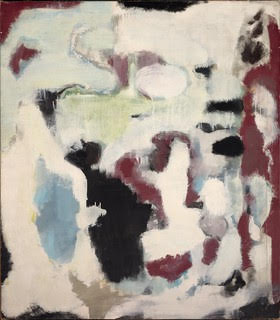
Mark Rothko, Untitled, 1947, oil on canvas, Harvard Art Museums/Fogg Museum, Gift of The Mark Rothko Foundation, Inc. © Kate Rothko Prizel & Christopher Rothko / Artists Rights Society (ARS), New York ©President and Fellows of Harvard College.
Compared to No. 2, Rothko subdues the materiality in Untitled. Yes, there are moments where the material shines through such as drips of paint or the paint capturing the texture of the brush or sponge used, but the material is not something that confronts the viewer as it is with No. 2. The lack of overt materiality in Untitled allows for the painting to have a drama of its own. Compared to Pollock’s mark making, Rothko’s marks have less definition. The cloudy forms of color lack distinct borders as they expand and contract into one another. While Pollock’s mark conjures images of him in studio splattering paint, Rothko’s mark does not allude to his studio practice. The artist’s presence fades away as form and color take over. These forms are not recordings of Rothko's encounter with material, but act as their own autonomous entities to which Rothko gives life. The way in which these formal entities interact with each other creates its own drama without being strictly tied to the drama of Rothko creating the work.
Not only does Untitled’s emphasis on form subdue the action of its creation, but also its two-dimensionality. Without the image of Rothko creating in the studio, it becomes easier for the viewer’s mind to forget about the painting’s two-dimensional qualities. As the viewer gazes over time, the forms interact with each other as one may come forward and the other recede. However, in his essay, “Modernist Painting,” Greenberg accounts for this: “the illusion created by a Modernist painting is one into which one can only look, can travel through only with the eye.” There is no mistaking Rothko’s Untitled for an illusionary space in which the viewer can orient the body. It is a work which strictly plays out in the eye of the viewer. While Untitled still adheres to the unique two-dimensional aspect of painting, it does so to a lesser extent than No. 2. The emphasis on materiality and lack of emphasis on form in No. 2 that never allows the viewer to forget about the flatness of the painting is not present in Untitled, allowing flatness to take a backseat to formal relationships.

Josef Albers, Homage to the Square: Against Deep Blue, 1955, oil on masonite, Harvard Art Museums/Busch-Reisinger Museum, Anonymous gift © The Josef and Anni Albers Foundation/Artists Rights Society (ARS), New York ©President and Fellows of Harvard College.
Moving into the Mid-Century Abstraction II exhibition, Josef Albers’ work from 1955, Homage to the Square: Against Deep Blue, appears to be an intensification of Rothko’s Untitled. The colors are brighter and forms more structured, but Albers’s presence finds a way into his work unlike Rothko’s. Albers treats his series, Homage to the Square, as an experiment. In “The Color in My Paintings,” Albers states his intentions are “to make obvious how colors influence and change each other.” He approached each painting in the series in a systematic way in order for the colors to speak for themselves. Viewing Against Deep Blue, this mechanical process comes through in the even application of paint onto masonite. This avoids any brushwork that could detract from the colors, but Albers’ presence still shines through. Rothko’s presence recedes through his hazy mark making which allows his forms to breath life of their own, but Albers’s definitive mark making is more akin to Pollock’s.
Albers shaped the color in Against Deep Blue in a calculated manner in order to produce the desired results. Even though Albers did not know the optical experience that results from viewing two red squares nested in a blue square, he knew how to structure each form. When viewing Rothko’s Untitled, the paint has a sense of autonomy as if it shaped itself, but with Albers and Pollock, it is clear that an artist’s hand was involved in shaping the material. In the exhibition, Against Deep Blue is shown adjacent to another painting from the same Homage to the Square series. This emphasizes Albers’ repetitive process of laying the paint down onto masonite in various combinations. Even though Albers intended Against Deep Blue to elucidate color relations, it also speaks to Rosenberg’s theory of action-painting. Albers’ process of creation is evident through his definite shaping of material, and in turn reminds the viewer of Greenberg's two-dimensional characterization of modernist art.
No. 2, Untitled, and Against Deep Blue present the viewer with varying degrees of the artist’s presence. While Pollock and Albers take control of the material they are working with making their presence visible, Rothko’s presence recedes as he allows the material to have control of its own. The dynamic created between materials and artists, who have control, shapes all three of these works, but is never quite resolved. This tension speaks to our species’ position in the world. Do we assert ourselves over our surrounding material, the natural world, and struggle as we shape it to our benefit? Perhaps relinquishing control and respecting the autonomy of our surrounding material via a laissez-faire approach is the path to harmony.